Thank you for supporting my last renderings set, Quadrangle.
Quadrangle is a courtyard surrounded by few buildings with different functions. Each family members with their own role in the big house, the flow of the layout present this culture quite clearly.
I worked on the renderings on and off during my free time more than a year. Software used: 3ds Max, Vray, AE, Photoshop. Here by I write a simple making of to share my little experience during the process.
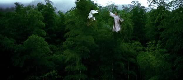
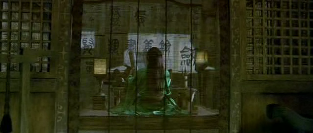
I was inspired by the some scene of movies, likes Crouching Tiger, Hidden Dragon 臥虎藏龍 (2000), Hero 英雄 (2002 ), House of Flying Daggers 十面埋伏 (2004), The Banquet 夜宴 (2006) and so on.

I watched those movies repeatedly and try to read the messages in the scene. With the direction, I browse the net as well to collect some references, including building detail, environment and mood.
I downloaded the Sketch Up model online, then imported into 3ds Max to refine the model. This was a long process.
I started texturing during remodel process, example the roof tiles. Most of the material set with Composite map to mix around multiple textures, tutorial from Richard Tilbury. I think that this method may not Ram consuming but best suit my ''keep on adjusting" workflow. :)
The roof tiles is the randamized using MAXScript as below and mapped with 3 variation of colour tones. Texture map mostly downloaded from CG Texture. Then, attached small tile pieces together and applied second map (mossy texture) using VrayblendMtl with different Map Channel and UVW Map to make even more variation of tones yet connectivity in the attached tile. Each building materials set with VrayDirt map for the ageing look. Then, MUST proxy it to save polygon count. :(
Some textures from Google, its pattern come with its meaning actually and link to the current dynasty and family role in the society
Some Photoshop painted textures up to 4k resolution to ensure detail for closer view. The ink wash painting looks with small detail on it.
The environment ground was hand made using Paint Deformation tools. Vegetation near by was painted using
Advanced Painter script. Thanks Herman Sasono for the amazing tools. The rest were scatter around using Multi Scatter even the background trees! And, Alessandro Ardolino's script, Rock Generator. :)
The dry leaf was placed on floor using Advanced Painter script. Dry leaf on the roof top was created via PF Scource, but the leaf was placed evenly so I used Random Select script from feilang to delete certain part so that the dry leaf more ''focus'' on the bottom part of roof. >.<
The ivy was made from Ivy Generator from Thomas Luft with some customisation on the material, smaller size and crowded. Some was put on the lake side as water plants floating on the water surface and soften the edge between ground and water.
Lighting setup was just VraySun, Sky and some scene with lit up with HDRI. I just keep it simple yet dramatic. Grap the correct mood is essential, I always update the references folder, add or delete, and redo in scene if required, until it felt right. The right balance of bright and dark area in a visual contribute greatly adjustment in post work.
Most scene render with VRayEnvironmentFog in different pass and combined in post work. The fog made the atmosphere alive, especially created the "glowing" looks.
Raw rendering save as OpenEXR 32 bits to ensure amount of colour information.
Most scene render with VRayEnvironmentFog in different pass and combined in post work. The fog made the atmosphere alive, especially created the "glowing" looks.
Raw rendering save as OpenEXR 32 bits to ensure amount of colour information.
Post work was the most important steps for me to emphasize the mood and feel. It may sound abstract that I think sincere and clam during the process was the key to express something into a visual piece. I can't get it right if I was in something negative thought or over excited. >.<
Each visual was toned with a theme colour represent its content, the mood and feel. First step was AE, mainly to tune the rendering into the main theme.
Save the output as Tiff with trillions of colors (16 bits), then second step, Photoshop to fine tune the visual. One of my favourite tool was Adjustments>Variations.
I hope this is helpful. Thanks for reading.


